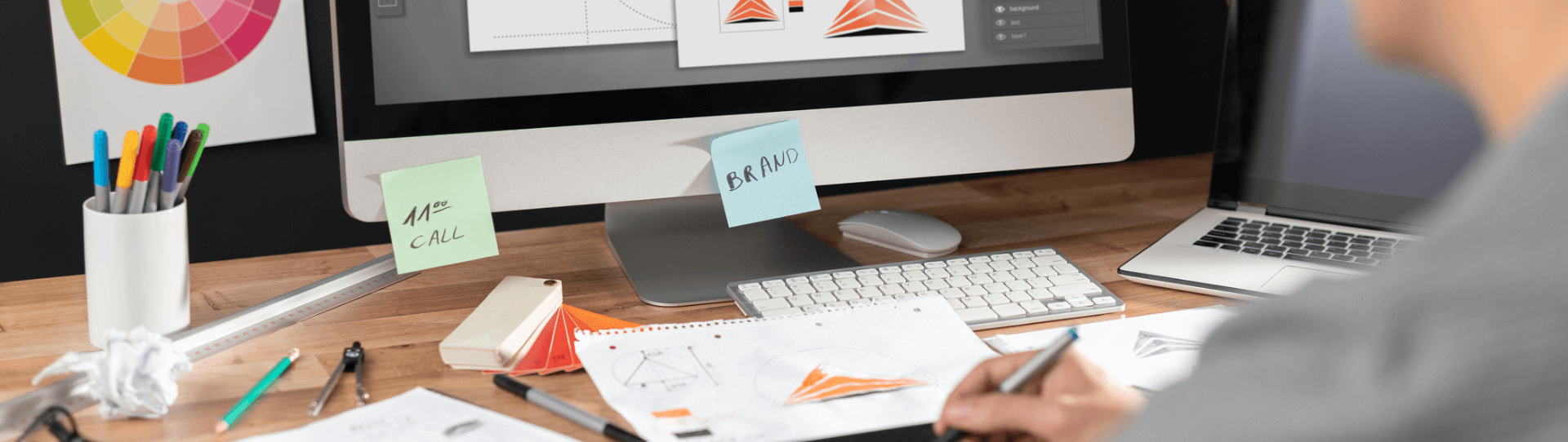
BRAND IDENTITY
Employers: Build an
Internship Program
To help candidates get an entry level role, during this COVID situation
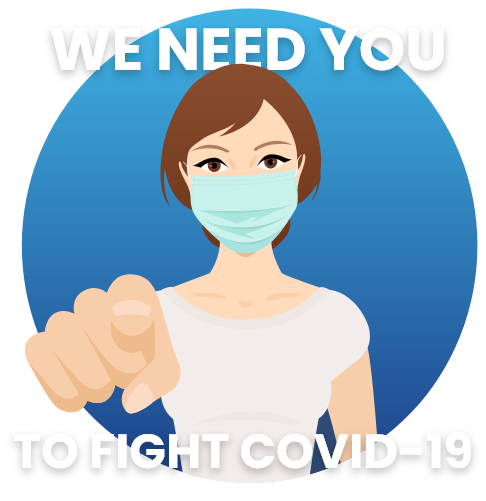
How can we help you?
To help candidates get an entry level role, during this COVID situation
How can we help you?
Internwise is an online job board platform for the niche of internship recruitment. Our vision is to help reducing youth unemployment rates.
The "ideology" behind the logo building:
Logo color variations for different purpose or places. These will help you determine the best way to use our logo.
MAIN LOGO
BLACK LOGO
WHITE LOGO
HORIZONTAL LOGO
HORIZONTAL BLACK LOGO
HORIZONTAL WHITE LOGO
Please don't use our name, logos, or screenshots ("brand materials") in ways that may be confusing, misleading. And please don't edit or change our logo — we are happy with it!
Don’t type out IW in any other fonts.
No other colored logo.
Logo should always be
accompanied by the IW Icon.
Don’t pair the logo with other Icons.
Avoid stretching or compressing the logo..
Don’t use wrong color Background.
Primary colors : Shades Of Blue
Secondary colors : Sweet & soft tones
C 100 M 86 Y 15 K 3
R 29 G 65 B 137
Hex 1d4189
C 64 M 10 Y 1 K 0
R 64 G 180 B 229
Hex 40b4e5
C 0 M 49 Y 65 K 0
R 255 G 153 B 97
Hex ff9961
C 9 M 5 Y 2 K 0
R 228 G 232 B 241
Hex e4e8f1
Social icons are individually designed based on specifications. Always align the logo center vertically and horizontally to best fit round shape.

The aim of our brand identity is to define a more powerful, compelling and different way of talking Internwise.eu. We are happy with our logo. use as it is. please don't edit or change our logo.